
Technologies in this project:
Website stack: HTML, CSS, JavaScript
Web map library: Leaflet
Tile Hosting: Azure blob storage *(also ESRI label layer, CartoDB – Dark Basemap)
Data Processing: These datasets are small enough to handle with standard desktop processing such as QGIS or ArcGIS Pro. Some specialized alpha layer processing is needed for proper handling of alpha (transparent values).
This project started out by noticing an ESRI post about the NASA Black Marble (night time satellite imagery) datasets being released. Shortly after a few projects popped up such as Digital Geography’s slider comparison and ESRI’s Difference Detection map. ESRI also has a story map and blog post with more detail regarding their process. There were a couple of quirks to me, and I decided to check out a few of these setups myself and decided on an interactive system that also did more with the data. Overall, I think it allows for a much better overview of the data.
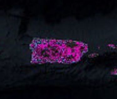
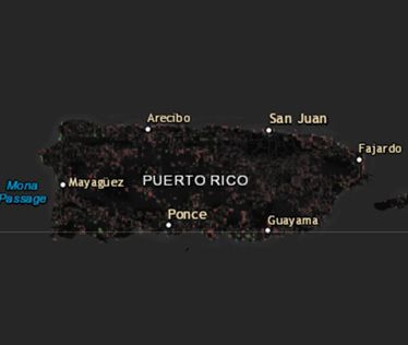
However, ESRI’s project does have an excellent layer to it.. the “difference” highlights. Although flipping or sliding allows you to compare visually, this method can help highlight important changes very noticeably while exploring and has the added bonus of producing rough estimates with raster analysis. Theoretically you could calculate the number of pixels with light changes to determine a rough area of added light versus an area of receding light. I, personally, did have some reservations to the results that ESRI posted. As an example, a closeup with Puerto Rico showed that it appeared quite magenta to indicate receding light. However, if you compare the lighting on the imagery sets there is definitely some receding… but it doesn’t seem quite so pronounced as the graphic indicated to me. Due to my misunderstanding of the intensity, I was expecting a much darker island which is definitely not the case. I predict this was caused by Arc’s inability to handle a wide variety of transparency issues. ArcGIS Pro has a lot of improvements and should have been able to handle this, but there isn’t necessarily a scale for such on the map as I see it. Regardless, the intensity difference mostly appeared to be binary – receded or intensified, but not any measurable difference. Below I have a comparison of my receding difference calculation on Puerto Rico where the difference is shown with transparency:
Puerto Rico Lights (ESRI Example)
Puerto Rico Lights (intensity calculated)
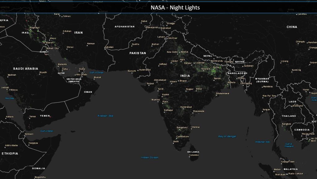
As such I wanted to have the same highlighting, but with a scale based on transparency that would highlight changes based on their intensity. Since this is an early project keeping things simple with one of the fastest mapping libraries out there, Leaflet, seemed like a great fit. Below is my end result. The light differences aren’t as vibrant for a “wow” factor, but should show the actual changes in light intensity more accurately. Places such as North India (likely due to successful significant infrastructure initiates) and Syria (likely due to civil war causing infrastructure problems) still have more noticeable patches.
In the past I did consider using a color gradient to show changes in intensity but felt it was a bit too confusing. It also wouldn’t work out as well from a future calculation standpoint as the tiles now will have an approximate “intensity” value that is essentially a matching alpha (transparency) value normalized from the 0-255 binary light values of the original data.
NASA – Night Light Comparison is a self-hosted project in my Azure environment I put together that has these factors. A small interactive version is also below for you to check out.
Nerd Stuff
⚠️🗓️ The resources have largely changed since this project was done. As such I’ll likely have some steps outlined, but various links or steps have probably be simplified for the sake of software version changes, button-ology, and a few other things that haven’t stood up over time. I’ll have little blurbs such as this one to outline new sources and methodologies where feasible. Either way, thanks for checking things out!
Below I’ll have an overview of the process I went through to showcase how an extra step or two could get a good amount of extra information from data. Feel free to stick around if you wanted to see how the sausage was made, but it could be quite a bit!
- ArcMap/ArcGIS Pro (open source alternative: QGIS)
- Photoshop (if alpha editing isn’t available) (open-source alternative: ImageMagick and GIMP)
- GDAL (open-source, I’m not aware of a better tool for the job!)
Step 1: Data Download
⚠️🗓️This resource has changed drastically. Probably a lot easier to get a list of options from here and download from Amazon S3: https://search.earthdata.nasa.gov/search
The first step was to get the raw imagery from the NASA download page. This page has the highest resolution I could find and the important grayscale lights. On this page you’ll find five datasets. The processed color imagery with lights on a dark background for 2012 and 2016, intensity values (grayscale imagery of lights only) for 2012 and 2016, and the previous color composite for 2012 using their old technique. For this setup, I used every set but the old 2012 color composite technique. You can download the sets in full resolution (500m) by downloading the tiles for each set. I highly recommend starting with the GeoTIFFs as they will already be georeferenced, and all you have to do is mosaic them. The colored images will provide the Basemaps for the online web map to switch between, and the intensity values will be used for actual processing and analysis.
Although a similar method of detecting change could be used with the original imagery, this set is significantly more accurate. There is no imagery in the background to “alter” the color of lights or their bloom, just raw values to work with. This means that if we were to take a particular pixel and see that it had a value of 0 for 2012, then see that same pixel had a value of 100 in 2016, it was significantly brighter. This applies vice versa and allows us to accurately determine which pixels were actually brighter, which were dimmer and which ones stayed exactly the same. My attempts at a change detection with imagery classification did yield similar results (which I unfortunately didn’t save for posting/comparison). However, the blooms seemed to deviate in some areas quite a bit. There were occasional random spots that would disappear based on my classification breaks. I just didn’t find it to be as reliable. How much red, green, and blue do you need to take away to consider light loss, especially when the background deviates in all three? I think it is best to just stick with the linear binary dataset.
Step 2: Data Organization
After downloading the four datasets (which ends up being several gigabytes), I’m ready to start some work. I end up simply dumping all of them into 4 separate Mosaic Datasets as the easiest way to process them.
GDAL also has similar capability with Virtual Raster Format (VRT).
This leaves the original data untouched for easy use later on and allows us to process them without creating extra data. It is perfectly fine to mosaic them into their own separate rasters if you prefer to do this, I would just recommend that you avoid applying any permanent stretch on the intensity rasters that might alter values.
Step 3: Calculating Light Intensity Values
Time to single out the intensity datasets and prep them for simple raster operations. However, they are provided in RGB format. Since the raster is grayscale, all bands (Red, Green, and Blue) have identical values (i.e., [0,0,0] for black, [255, 255, 255] for white, and [115,115,115] as a shade of gray). This means we can use any band we would like as a singular band to set as an intensity value. The quickest way I found to do this was to use the Imagery Analyst window in ArcGIS. You can highlight your layer (such as BlackMarble2012) and single out one band by using a Band Arithmetic function.
If you already have a mosaic dataset like I did, you can use this button or check out the properties of your raster and then the functions tab as an alternative. From this function’s menu, right click on any of your steps and Insert Function… > Band Arithmetic. Set the expression to your first, second, or third band. Since they all have the same values it doesn’t matter which you choose, as long as you only set one of them.
There are a few other ways that you could come up with similar results, such as the ‘Grayscale Function’ or Make Raster Layer tool. This was just my personal preference. The tool may be ideal for someone wanting to save an entirely new file, but I prefer to work with the singular mosaic dataset so I haven’t added any extra data to my workspace yet. Also functions allow you to go back and edit them if you didn’t get your parameters quite right. Totally awesome!
One other thing we’ll need to consider is the bits of our output. Initially ArcGIS is often going to want to turn our raster into a 16bit or 32bit raster. Which is unnecessary and likely to cause problems later. If you chose to utilize the function approach you can go to the second tab on any function and change the bit depth dynamically. Otherwise, when you save your raster, ensure you have a bit depth of 8-bit unsigned. I always like to think of it as unsigned has no sign (to include a negative sign) so therefore you have no negative numbers and must be positive only. Now the values will accurately represent the intensity values we want to work with. This step can also be important when reducing data at scale. No need for more data that isn’t of value, especially as you get into bulky and big data.
Once we have this setup, our raster should be a single band 8bit unsigned raster. This allows us to apply a color ramp and do some basic math to determine intensity changes. This is as simple as using the Minus Tool. With this tool a pixel value from the first raster will have the spatially relative pixel value from the next raster subtracted and the value after this operation will be applied to a new raster. In this event, if we take the 2012 intensity values and subtract the 2016 values, we should get a raster of positive and negative numbers. If the numbers are negative, then the value in 2012 was lower in 2012 than 2016 since less intensity in 2012 is being subtracted from the higher intensity in 2016. Negative numbers mean the light in the area grew. If the numbers were the same, such as where there were no lights for both years, or the intensity value stayed the same, we would get 0 to indicate no change. If the value was positive the opposite would be true, the value during 2012 was higher and therefore still positive after being subtracted by a lower 2016 intensity number. This raster gives us all the information we need to quantify whether light grew or receded and by how much. All negative numbers indicate growth, positive numbers indicate receding light, zeroes indicate stagnation, and the further the value is from zero sets the intensity of that change.
Step 4: Applying Color Ramps to Intensity Values
⚠️🗓️Vast enhancements have been made to ArcGIS Pro since this project was done initially. I’ll edit the generic workflow for ArcGIS Pro, but otherwise this was originally done with QGIS or some other image manipulation command line interface (CLI) to handle transparency. Popular options would have been GDAL (with some alpha manipulation) or ImageMagick.
Step 4-a: Re-georeferencing Intensity Values
⚠️ Only necessary if exporting to an option that doesn’t support transparency and georeferencing.
Now here’s the bad part. We took one step forward by getting appropriate transparency, but we took one step back because a lot of processing strips the georeferencing information from our .PNG (or other acceptable transparency-supporting format). Doh!
Here is an example of how to utilize GDAL to georeference:
gdal_translate -of PNG -a_ullr -180.0 90.0 180 -90 -a_srs EPSG:4326 <input.png> <output.png>in order to save to a new .PNG file and define the coordinate system and extent. Since we already know that this covers the entire world, we can set the extent to the extreme values for the latitudes (90, -90) and longitudes (-180, 180). The -of PNG options tells GDAL to save as a .PNG. The -a_ullr expects four values with the upper-left and lower-right coordinates in the format: -a_ullr <left_longitude> <top_latitude> <right_longitude> <bottom_latitude>. Seconds later, and you’ll have a clean version with transparency and spatial information.
The only change that is required for your alternative raster is updating the input and outputs. Afterwards you’ll be left with two .PNG files ready for web processing.
Step 5: Preparing Data for Web Mapping
At this step, there are numerous ways that you can go from here. My typical goal for such projects is to have a version of a web map that can
- Be used in an “offline” environment as a simple structure.
- Can be hosted without the need for server architecture setups (i.e., ArcServer, GeoServer).
You can use open-source libraries and specifications to turn this data into an offline web map you can utilize from your computer’s local files. You can even upload these files to any raw storage you would like and they will continue to work with minimal (if any) changes. You can get a web map up and running using web technologies and libraries easily, you only need to worry about cost once you decide to host, which is typically not expensive either. I believe this project would cost me $0.05 a month if it ever got used heavily. As such I think this is the best option for the scope of a small project like this.
In order to use this data, I utilize the TMS tile specification which should work flawlessly for web libraries such as OpenLayers, Leaflet, Mapbox, Cesium, ESRI options, etc. This is a genius way that data can be programmatically cut up into many very small tiles. They are ordered in folders with numbers and given numbered names. They will be non-georeferenced images that mapping libraries will know how to appropriately load based on the numbering system they are saved in. Essentially, the mapping libraries will load only a few tiles at any given time and since most are small (think 5-20kb). Even on very large monitors, you may only be loading 100 tiles at any given time. This will be true at any scale, so load/render times are consistent and you can load as much detail as you want to process/host. There are many other alternatives that may be more efficient and/or powerful, but this setup is simple to create, understand, and work with.
There are several simple ways to create tiles. If you are brand new and not a big fan of command-line, I would recommend checking out QTiles. It is an amazing plugin that will take your data as rendered in QGIS and create tiles out of the project. The user interface is fairly easy to understand, and the progress bar is awesome. This plugin does falter when your data is so large that QGIS has difficulty rendering it (shouldn’t be an issue with the relatively small size of the data in this project), and that it only uses one core (although you can process several layers from separate QGIS instances). However, I decided to go with GDAL for this one again. GDAL has gdal2tiles.py which is a simple command-line based option that will process your data quickly with quite a few nice options. It is actually the foundation of the QTiles plugin!
⚠️🗓️There are a lot of branches based on gdal2tiles.py, however newer version of GDAL also support parallel processing and utilize a different driver: gdal raster tile. If redoing this project I would recommend the .webp file format to save yourself a few steps!
gdal2tiles.py uses a format similar to this: gdal2tiles.py -r near -z 3-8 <source file> <destination folder>. With this command, gdal2tiles takes your input file, and does all the work to cut up the tiles and save them in the supplied destination folder. So really all we need is something like our intensity .PNG files, and an empty folder to dump the tiles into. A command like this should start creating tiles for us:
gdal2tiles.py -r near -z 3-8 C: "...\path\to\NASA-NightLights\IntensityMarble2012\RecedingLights2012.png" "...\path\to\NASA-NightLights\IntensityMarble2012\RecedingLights2012_Tiles"Note the quotes, these are only required if your path has spaces in it, if you don’t have spaces they won’t hurt though. In this example GDAL will take our RecedingLights.png and save the TMS structure in a folder right next to it with the name RecedingLights_Tiles. -z 3-8 refers to the zoom levels. 0-2 were left out because I don’t expect users to zoom out that far, and since it provides no useful resolution it just cleans things up a bit. The resolution of this data (at 500m) is fully detailed by level 8. Anything further and I’m wasting tons of time processing and storing the extra data for no additional resolution. In fact, I could likely get away with 7 and interpolating level 8 if I wanted to save some space. You can build any levels you might like, but keep in mind that every additional level approximately quadruples in the number of tiles from the previous level. For the entire world, that adds up quick. Either way, here’s an example of how my output turned out.
Rinse and repeat for your alternate intensity raster, then on to the Black Marble Imagery!
Initially, if you were using Mosaic Datasets such as in this workflow, you’ll need to take a quick additional step as they are not supported by GDAL. If you happened to export them to a singular .tif file (as an example), then you can skip this step.
Step 5-a: Utilizing GDAL as opposed to ESRI mosaic datasets
GDAL can mosaic rasters on the fly similar to a mosaic dataset using virtual rasters (.VRT). These don’t have all the power that a mosaic dataset has, but will quickly allow all of our .tif files to act as one file which is perfect for use in things like QGIS or GDAL.
You can create a .VRT in seconds with a GDAL command like this:
gdalbuildvrt "...\path\to\Nasa-NightLights\BlackMarble2012\*.tif" "...\path\to\Nasa-NightLights\BlackMarble2012\BlackMarble.vrt"Note the asterisk. Normally GDAL requires a list of files that you want to add to the .VRT, but I chose the wildcard (*) to tell GDAL to accept all .tif files within that folder. This can be very useful when you have more than 8 files! Either way, it will take all supplied files and output the .VRT. In my case it saves in the same folder right next to my .tif files.
From here, the process is the same as our previous gdal2tiles.py script except changing the names appropriately and using .vrt instead of .png. Here is another example:
gdal2tiles.py -r near -z 3-8 "...\path\to\NASA-NightLights\BlackMarble2012\BlackMarble.vrt" "...\path\to\NASA-NightLights\BlackMarble2012\BlackMarble2012_Tiles"Once again, rinse and repeat for your alternate Black Marble layer to get the final tile set, woo!
Step 6: Connecting the Data to a web map.
Again, numerous ways that this can be tackled. I personally use Leaflet as my preferred mapping library for smaller quick projects or web maps that must be built programmatically specially for visualization. I find it the lightest and easiest solution to work with. It will be what this post covers here on out. However, any other mapping library worth its salt will handle TMS tiles built above just fine.
Leaflet has many tutorials to get anyone started in web mapping, but even if you are not terribly familiar with it.
If you take a look at the local files in this template there are only a few components. The .html file to load in a browser, a CSS folder with our style files, a JS folder for scripts, and the data folder for… well… data. The data folder is where we are going to store the tiles. In this project, the tiles are the only data we will be using, so this setup allows us to easily point to them. The template’s HTML code in its entirety looks this:
<!DOCTYPE html>
<html lang="en">
  <head>
    <meta http-equiv="content-type" content="text/html; charset=UTF-8">
    <meta charset="utf-8">
    <title>NASA - Night Light</title>

    <link rel="stylesheet" href="css/leaflet.css">
    <link rel="stylesheet" href="css/nightlights.css">
  </head>

  <body>

    <div id="map"></div>

    <script type="text/javascript" src="js/leaflet.js"></script>

    <!--Map Script-->
    <script type="text/javascript">
      var BlackMarble2012 = L.tileLayer('data/tiles/BlackMarble2012/{z}/{x}/{y}.png', { tms: true });
      var BlackMarble2016 = L.tileLayer('data/tiles/BlackMarble2016/{z}/{x}/{y}.png', { tms: true });
      var RecedingLights = L.tileLayer('data/tiles/RecedingLights/{z}/{x}/{y}.png', { tms: true });
      var NewLights = L.tileLayer('data/tiles/NewLights/{z}/{x}/{y}.png', { tms: true });

      var MainMap = L.map('map', {
        layers: [BlackMarble2012],
        center: [25, 0],
        zoom: 3,
        minZoom: 3,
        maxZoom: 8,
        maxBounds: [
          [-70, -200], /*south west*/
          [70, 200] /*north east*/
        ]
      });
    </script>

  </body>
</html>⚠️Note: A quirk with this code that is not common among other coders is that I personally use the variable MainMap as opposed to map. This has helped me personally with differentiating between ‘map’ when it is referring to the element ID or the variable within JavaScript, especially when utilizing multiple maps (like with a reference map). It makes a big difference to me, but if you are copying code from other areas/sources, it won’t be applied unless you ensure the MainMap variable is being matched or changed appropriately. It is significantly more common to see map as the variable when referencing a Leaflet code.
We have all of the basics of an HTML setup to include pulling local Leaflet dependencies: js/leaflet.js and css/leaflet.css.
In the above HTML code lines 18-21 are highlighted since they show where we are linking the tile data. By using relative paths in our .html file we can ensure that the data is being pulled even from a local directory. As long as the tiles are in the same location relative to the .html file it will be able to load them, whether on your desktop or on a server. Leaflet understands this statement: L.tileLayer ('data/tiles/BlackMarble2012/{z}/{x}/{y}.png', {tms:true}); as a new layer where {z}, {x}, and {y} are variables that will search for the available tiles currently in Leaflet’s map extent. {tms:true} informs Leaflet that this is a TMS layer. This is simply a slight specification difference from similar XYZ tiles where the ‘y’ value is inverted. One starts y’s value from top to bottom and the other from bottom to top. At this point we just repeat the process by updating to the appropriate folder path per layer.
Step 6: Finishing off the map: JavaScript
Overall, this next section is just a showcase of how I finished with the web map. Although the data is loaded it isn’t terribly useful without giving the user control to swap between layers.
Below is some JavaScript code to get the map initially set up:
var MainMap=L.map('map', {
    layers:[BlackMarble2012], //loads a previously defined layer variable
    center:[25, 0], //the latitude&longitude where the map will be centered when loaded
    zoom:3, //the default zoom level when loaded
    minZoom:3, //the furthest out level the user can zoom to
    maxZoom:8, //the furthest in level the user can zoom to
    maxBounds:[ //this sets the boundaries the user can't explore past
        [-70, -200], /*south west*/
        [70, 200] /*north east*/
        ]
    }
);Options such as center, zoom, minZoom, maxZoom, maxBounds are ones that I commonly used to keep users in place in case their panning/scrolling goes haywire and keeps the user in the area of interest.
So now all tiles are being connected and being called by specific variables, and we utilize one of them to add to the map right away with layers:[BlackMarble2012]. Next we can add our difference layers with some simple addTo(MainMap); commands.
This is done by adding the highlighted lines below:
<!DOCTYPE html>
<html lang="en">
  <head>
    <meta http-equiv="content-type" content="text/html; charset=UTF-8">
    <meta charset="utf-8">
    <title>NASA - Night Light</title>

    <link rel="stylesheet" href="css/leaflet.css">
    <link rel="stylesheet" href="css/nightlights.css">
  </head>

  <body>
    <div id="map"></div>

    <script type="text/javascript" src="js/leaflet.js"></script>

    <!--Map Script-->
    <script type="text/javascript">
      var BlackMarble2012 = L.tileLayer('data/tiles/BlackMarble2012/{z}/{x}/{y}.png', { tms: true });
      var BlackMarble2016 = L.tileLayer('data/tiles/BlackMarble2016/{z}/{x}/{y}.png', { tms: true });
      var RecedingLights = L.tileLayer('data/tiles/RecedingLights/{z}/{x}/{y}.png', { tms: true });
      var NewLights = L.tileLayer('data/tiles/NewLights/{z}/{x}/{y}.png', { tms: true });

      var MainMap = L.map('map', {
        layers: [BlackMarble2012],
        center: [25, 0],
        zoom: 3,
        minZoom: 3,
        maxZoom: 8,
        maxBounds: [
          [-70, -200], /*south west*/
          [70, 200] /*north east*/
        ]
      });

      RecedingLights.addTo(MainMap);
      NewLights.addTo(MainMap);

    </script>
  </body>
</html>Now your map should have the new/receding lights on it as well, but the next major step is to add some user control to this. We need to be able to switch between 2012 and 2016 imagery as well as turn difference layers on and off, so the user has as much control as possible.
This can easily be done by using Leaflet’s Layer Control. You can think of controls as widgets for a map that Leaflet provides some functionality for. This one allows users to turn off/switch between layers. In Leaflet there are a few types of layers, and we will be working with basemaps and layers. Basemaps are typically listed first and are designed to only have one on at a time. Layers are designed to be loaded as the user desires. For instance, there is no use loading 2012 imagery behind the 2016 imagery. Once both are loaded the 2012 imagery will not be visible but will spend time loading and making the map slower. I prefer to separate them out using the additional lines of code below:
<!DOCTYPE html>
<html lang="en">
  <head>
    <meta http-equiv="content-type" content="text/html; charset=UTF-8">
    <meta charset="utf-8">
    <title>NASA - Night Light</title>

    <link rel="stylesheet" href="css/leaflet.css">
    <link rel="stylesheet" href="css/nightlights.css">
  </head>

  <body>
    <div id="map"></div>

    <script type="text/javascript" src="js/leaflet.js"></script>

    <!--Map Script-->
    <script type="text/javascript">
      var BlackMarble2012 = L.tileLayer('data/tiles/BlackMarble2012/{z}/{x}/{y}.png', { tms: true });
      var BlackMarble2016 = L.tileLayer('data/tiles/BlackMarble2016/{z}/{x}/{y}.png', { tms: true });
      var RecedingLights = L.tileLayer('data/tiles/RecedingLights/{z}/{x}/{y}.png', { tms: true });
      var NewLights = L.tileLayer('data/tiles/NewLights/{z}/{x}/{y}.png', { tms: true });

      var MainMap = L.map('map', {
        layers: [BlackMarble2012],
        center: [25, 0],
        zoom: 3,
        minZoom: 3,
        maxZoom: 8,
        maxBounds: [
          [-70, -200], /*south west*/
          [70, 200] /*north east*/
        ]
      });

      RecedingLights.addTo(MainMap);
      NewLights.addTo(MainMap);

      var LegendBasemaps = {
        "Night Lights (2012)": BlackMarble2012,
        "Night Lights (2016)": BlackMarble2016
      };

      var LegendOverlays = {
        "New Lighting": NewLights,
        "Receding Lighting": RecedingLights
      };

      /* Legend Control */
      L.control.layers(LegendBasemaps, LegendOverlays, { position: 'bottomright', collapsed: false }).addTo(MainMap);

    </script>
  </body>
</html>In this code I separate my basemap and layers into groups, specifically I use the variables LegendBasemaps and LegendOverlays. These groups have the visible label in the control (I’ll just call it a legend for now), and the variable after the colon. Similarly to the GDAL command the quotes are necessary if your labels have spaces, but don’t hurt otherwise. Afterwords we add the control to the map with options: position: 'bottomright', collapsed:false to attach it to the bottom right of our map and to leave it open. If you refresh the map after adding these lines you can alter the layers all you like now. 😀
Step 7: Polishing the web map
I’ll be brief with these as this has already been a rather long post. Below I added a few convenience controls and the necessary stylings. As well as some third party layers, that help bring more information and aesthetics to the map if desired. Here is my completed code example:
<!DOCTYPE html>
<html lang="en">
  <head>
    <meta http-equiv="content-type" content="text/html; charset=UTF-8">
    <meta charset="utf-8">
    <title>NASA - Night Light</title>

    <link rel="stylesheet" href="css/leaflet.css">
    <link rel="stylesheet" href="css/nightlights.css">

    <link rel="stylesheet" href="css/controlhome.css">
  </head>
  <body>
    <div id="Banner">NASA - Night Lights</div>

    <div id="map"></div>

    <script type="text/javascript" src="js/leaflet.js"></script>
    <script type="text/javascript" src="js/controlhome.js"></script>
    <script type="text/javascript" src="js/leaflet.FadeOut.js"></script>

    <!--Map Script-->
    <script type="text/javascript">
      var BlackMarble2012 = L.tileLayer('data/tiles/BlackMarble2012/{z}/{x}/{y}.png', { tms: true });
      var BlackMarble2016 = L.tileLayer('data/tiles/BlackMarble2016/{z}/{x}/{y}.png', { tms: true });
      var RecedingLights = L.tileLayer('data/tiles/RecedingLights/{z}/{x}/{y}.png', { tms: true });
      var NewLights = L.tileLayer('data/tiles/NewLights/{z}/{x}/{y}.png', { tms: true });

      var DarkBase = L.tileLayer('http://{s}.basemaps.cartocdn.com/dark_nolabels/{z}/{x}/{y}.png', {
        attribution: '© <a href="http://www.openstreetmap.org/copyright">OpenStreetMap</a> © <a href="http://cartodb.com/attributions">CartoDB</a>'
      });

      var ESRILabels = L.tileLayer('https://services.arcgisonline.com/ArcGIS/rest/services/Reference/World_Boundaries_and_Places/MapServer/tile/{z}/{y}/{x}', { pane: 'ESRILabels' });

      var MainMap = L.map('map', {
        layers: [BlackMarble2012],
        center: [25, 0],
        zoom: 3,
        minZoom: 3,
        maxZoom: 8,
        maxBounds: [
          [-70, -200], /* south west */
          [70, 200] /* north east */
        ]
      });

      MainMap.createPane('ESRILabels');
      MainMap.getPane('ESRILabels').style.zIndex = 650;
      ESRILabels.addTo(MainMap);
      RecedingLights.addTo(MainMap);
      NewLights.addTo(MainMap);

      /* Legend Info */
      var LegendBasemaps = {
        "Night Lights (2012)": BlackMarble2012,
        "Night Lights (2016)": BlackMarble2016,
        "Dark Basemap": DarkBase
      };

      var LegendOverlays = {
        "Labels": ESRILabels,
        "<font style='color:#00ff00;font-weight:bold'>New Lighting</font><br><div style='width:100%;height:15px;background: -webkit-linear-gradient(left, rgba(0,255,0,0), rgba(0,255,0,1));background: -o-linear-gradient(right, rgba(0,255,0,0), rgba(0,255,0,1));background: -moz-linear-gradient(right, rgba(0,255,0,0), rgba(0,255,0,1));background: linear-gradient(to right, rgba(0,255,0,0), rgba(0,255,0,1));'></div><br>": NewLights,
        "<font style='color:#ff0000;font-weight:bold'>Receding Lighting</font><br><div style='width:100%;height:15px;background: -webkit-linear-gradient(left, rgba(255,0,0,0), rgba(255,0,0,1));background: -o-linear-gradient(right, rgba(255,0,0,0), rgba(255,0,0,1));background: -moz-linear-gradient(right, rgba(255,0,0,0), rgba(255,0,0,1));background: linear-gradient(to right, rgba(255,0,0,0), rgba(255,0,0,1));'></div>": RecedingLights
      };

      /* ADD CONTROLS TO MAP */
      L.control.defaultExtent().addTo(MainMap);
      L.control.layers(LegendBasemaps, LegendOverlays, { position: 'bottomright', collapsed: false }).addTo(MainMap);

    </script>
  </body>
</html>Here is a quick rundown of some of the overall items added:
- I also add a few styles to nightlights.css to make the default Leaflet elements darker and style other map elements.
- Line 14 I simply add a title banner in a futuristic style I’m fond of.
- We add some plugins for convenience and smoother experience. In particular I often use the Default Extent plugin and Fade Basemap plugin. These guys did a great job making it easy to install these. You can see some styling for the Default Extent control in line 19 and Fade Basemap plugin in line 20.
- I added two new layers from third parties (ESRI and CartoDB). ESRILabels and Dark Basemap instantly give the map more info and the ability to go for cleaner look. Both are called in lines 29-33. One trick about the ESRILabels is that since they aren’t loaded as vector data they, by default, will fall behind other tiles that are loaded based on order. They will always, by default, load behind vector data. To offset this, newer versions of Leaflet allow us to define custom panes with adjustable z-values. That is where lines 47-48 come into play. We can set the z-values of various panes to ensure our data is ordered however we like. Neat!
I believe that covers all of the polishing changes. This one was of my earlier projects that involved a little bit of everything and it will always have a special place in my heart 💖. Thanks for checking it out!